Product STRATEGY
DESIGN SYSTEM
UI DESIGN
Vtopia - A Web 3 Tech Hub
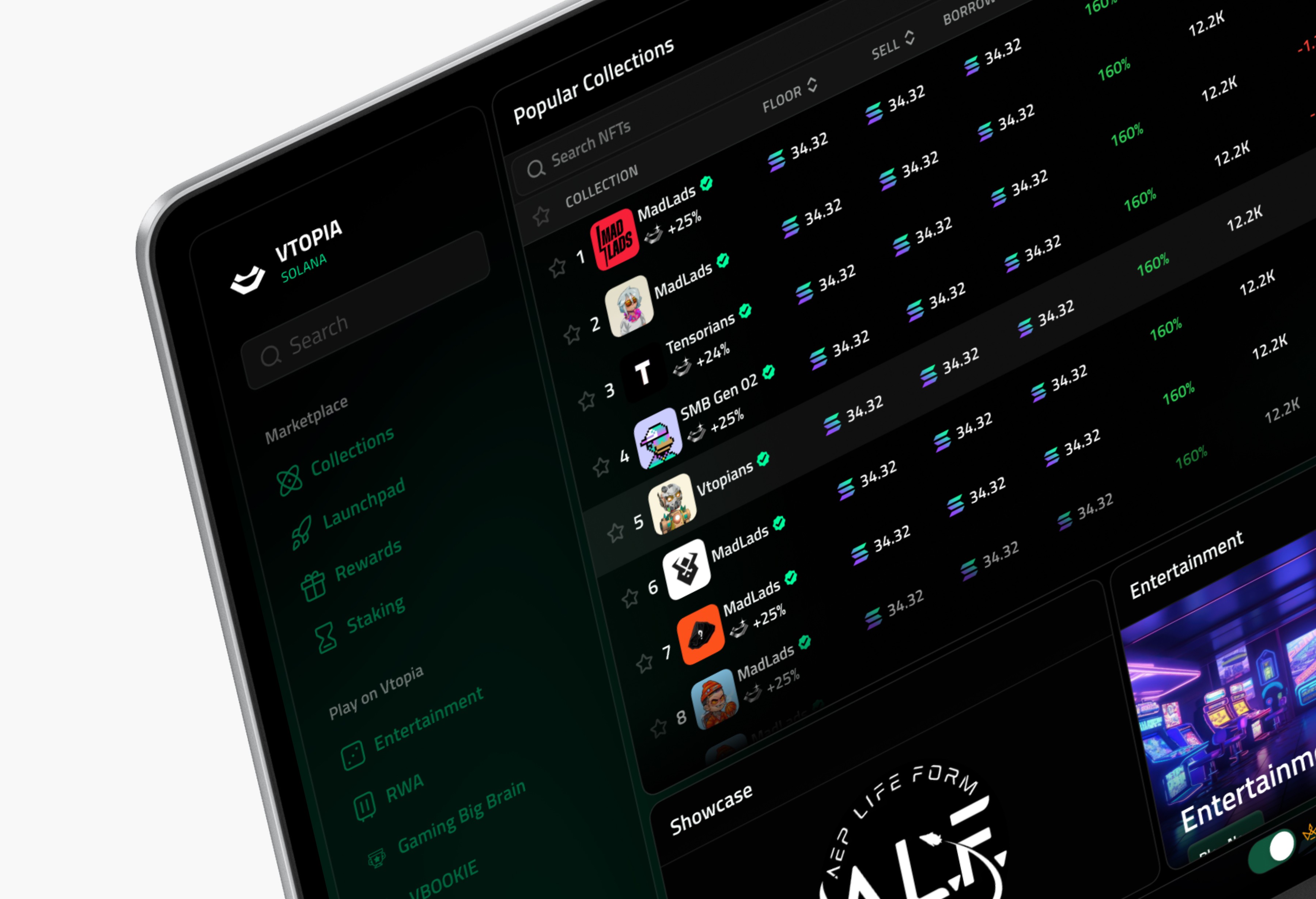
Vtopia is a Web3-powered NFT marketplace and tech hub built on Solana, where users can discover, collect, and trade extraordinary NFTs. I led the complete UI/UX overhaul of the platform to enhance clarity, navigation, and visual hierarchy ensuring scalability, developer-readiness, and user trust.
Impact at a glance
Faster navigation to core actions
+82%
Users onboarded post-launch
1.6K
Reusable design system
1
01 — OVERVIEW
The 20-second version
Vtopia had the tech to compete but was losing users at the door — no clear path from landing to first action. Over 6 weeks I audited the flow, rebuilt the information architecture, and shipped a scalable design system. The result: a marketplace that onboards newcomers and rewards power users, without slowing the dev team down.
70%
Faster navigation to core actions
250+
Users onboarded post-launch
1
Reusable design system for future features
02 — THE PROBLEM
Strong tech, broken journey
The original marketplace had potential, but no visual hierarchy and no clear path. New users didn't know where to start; advanced users couldn't move fast. Every second of confusion is a lost trade — and lost trust.
01
No purposeful flow
The journey from landing to action had no narrative. Nothing guided users toward discovering collections, claiming rewards, or making a purchase.
02
Buried entry points
Core sections — Launchpad, NFT-Fi, multi-chain views — were hidden or hard to reach. Users didn't know what to do next.
03
Unscalable design language
Inconsistent spacing, type, and component logic slowed development and blocked reuse across staking, browsing, and future features.
03 — MY ROLE & CONTEXT
What I owned
I led the end-to-end UI/UX overhaul — from auditing the existing flow to shipping a developer-ready design system.
Owned
UX audit, information architecture, wireframes, visual design, and the component / design-system layer handed to engineering.
Collaborated on
Worked directly with founders and 2 developers to pressure-test feasibility and scope against the roadmap.
Constraints
6-week window, desktop-first, existing brand equity to preserve, and everything had to be reusable for features not yet built.
04 — APPROACH
How I got there
Not a tools tour — a decision trail. Three moves took Vtopia from cluttered to clear.
1
Audited the flow, not the pixels
I mapped the real journey from landing to first purchase and marked every drop-off and dead end. The pattern was obvious once drawn: users hit three decision points with no signposting.
KEY INSIGHT
The problem wasn't ugly screens — it was the absence of a path. So structure had to lead the redesign.
2
Rebuilt the information architecture
I restructured navigation around what users actually came to do — discover, collect, trade — and surfaced buried sections like Launchpad and multi-market into a clear sidebar system.
◫ Flow map / wireframes / IA diagram — show your thinking
3
Built a token-based design system
I defined spacing, type, and component logic as reusable tokens so staking, browsing, and future features would stay consistent — and ship faster.
TRADEOFF
More time upfront on the system meant slower first screens — but every feature after shipped in a fraction of the time. Worth it.
05 — THE SOLUTION
The redesign, decision by decision
Not a gallery. Each screen is paired with the problem it solves — so the craft always ties back to a reason.
MOVE 01 — A HERO THAT ORIENTS
A defined hero, consistent stats layout, and one inviting CTA replaced the clutter. Users now get an immediate sense of what the platform offers and where to go first.
BEFORE — old hero
AFTER — new hero
MOVE 02 — DISCOVERABILITY FOR POWER USERS
A refined sidebar, multi-market toggle, performance metrics, and category modules let experienced users make fast decisions while still onboarding newcomers gently.
▦ Full dashboard / marketplace view — your strongest hi-fi screen
MOVE 03 — A SYSTEM, NOT A SET OF SCREENS
Token-based layouts and consistent components made the whole experience scalable — and gave the dev team a library instead of one-off designs.
◧ Component library
◨ Detail / mobile view
06 — IMPACT
Did it work?
The redesign didn't just look better — it moved the numbers that mattered to the business and the users.
70%
faster navigation to core actions after the IA rebuild
250+
new users onboarded in the first post-launch window
3×
faster feature shipping via the reusable system — [replace with your real figure]
↓
visual clutter and "where do I start" support questions
"The new structure made the product feel finished. Our users finally knew where to go."
— Founder, Vtopia · [optional client quote — pure gold if you can get one]
07 — REFLECTION
What I'd carry forward
→
Structure before surface. The biggest wins came from fixing the flow, not the visuals. I now audit the journey before touching a single screen.
→
Systems compound. The upfront cost of the design system paid back on every feature after. On future projects I'd build it even earlier.
→
Next time: I'd run 3–4 quick usability tests mid-project to validate the new IA before final polish, instead of relying on the audit alone.
Next project
Keep them inside your portfolio, then convert. End with a link to your next-best case study and a low-friction way to reach you.